Campaigns
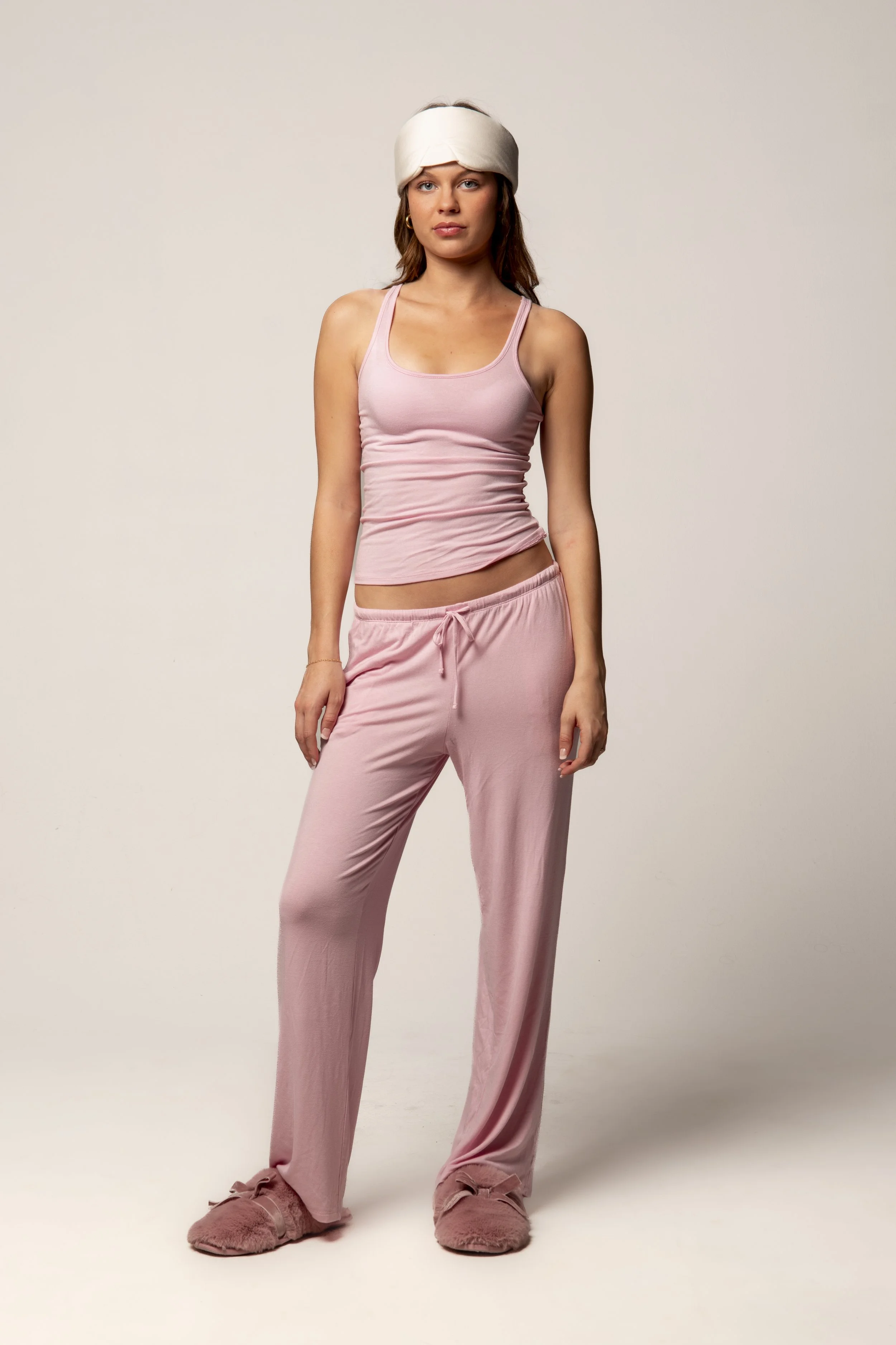
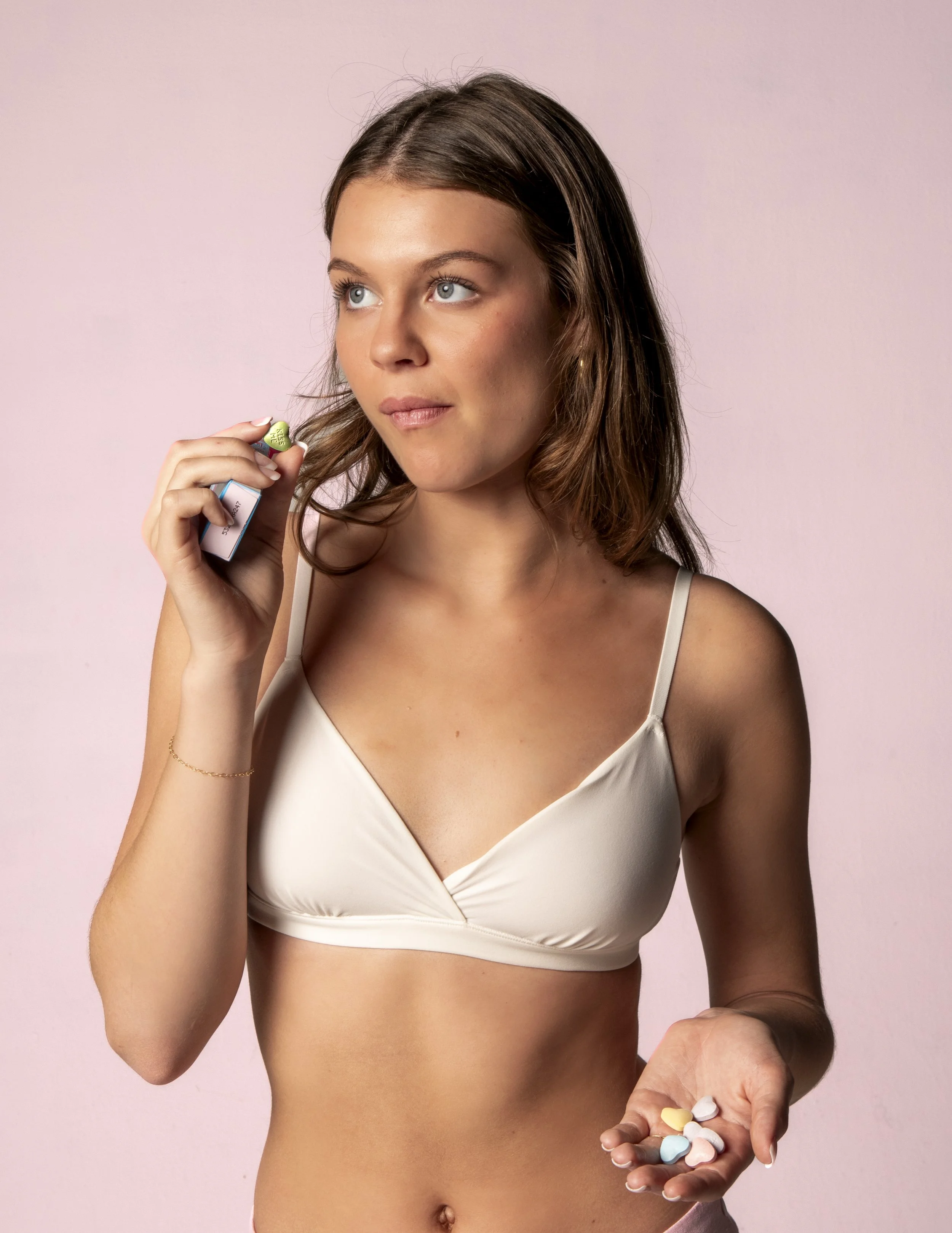
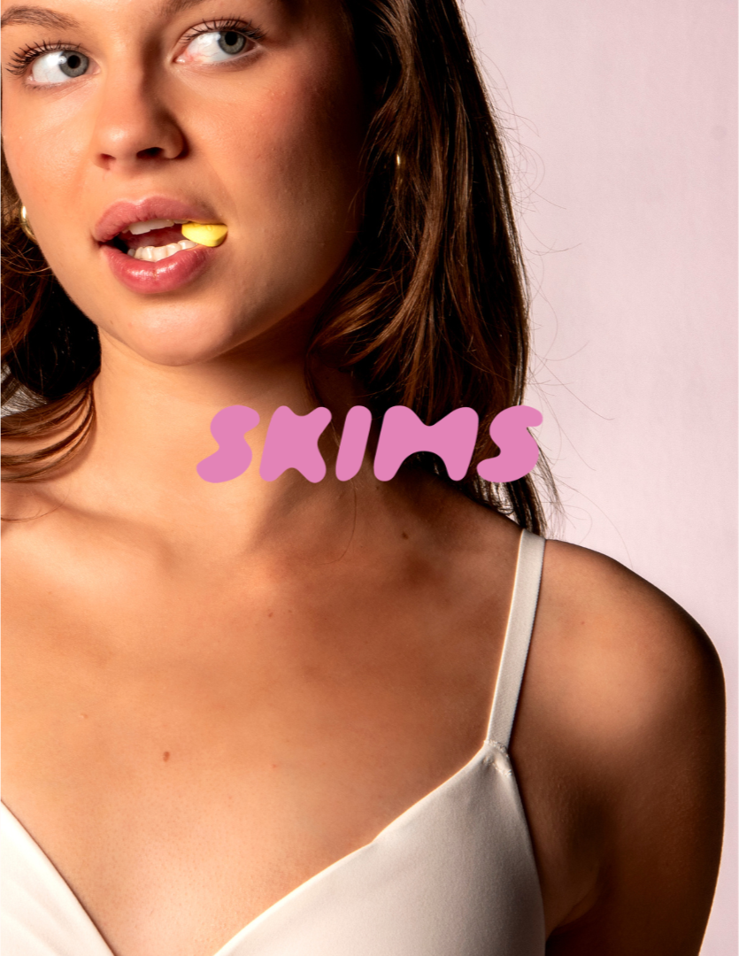
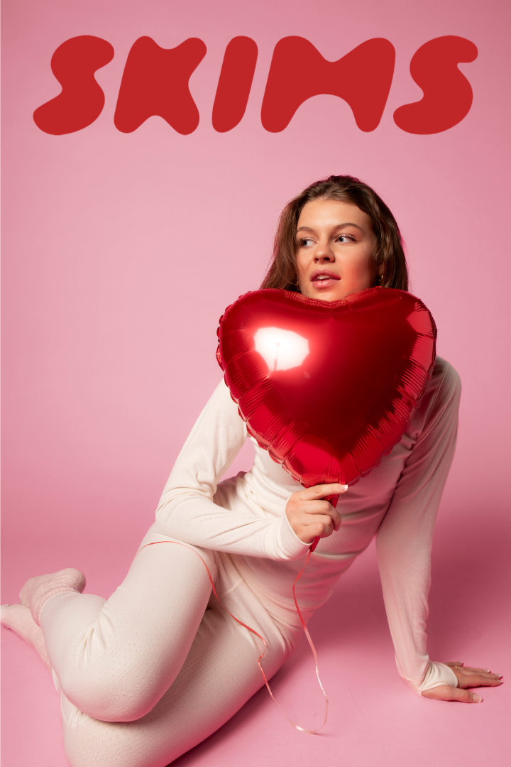
Skims Valentines Day
-
Skims Valentines Day -
The Concept
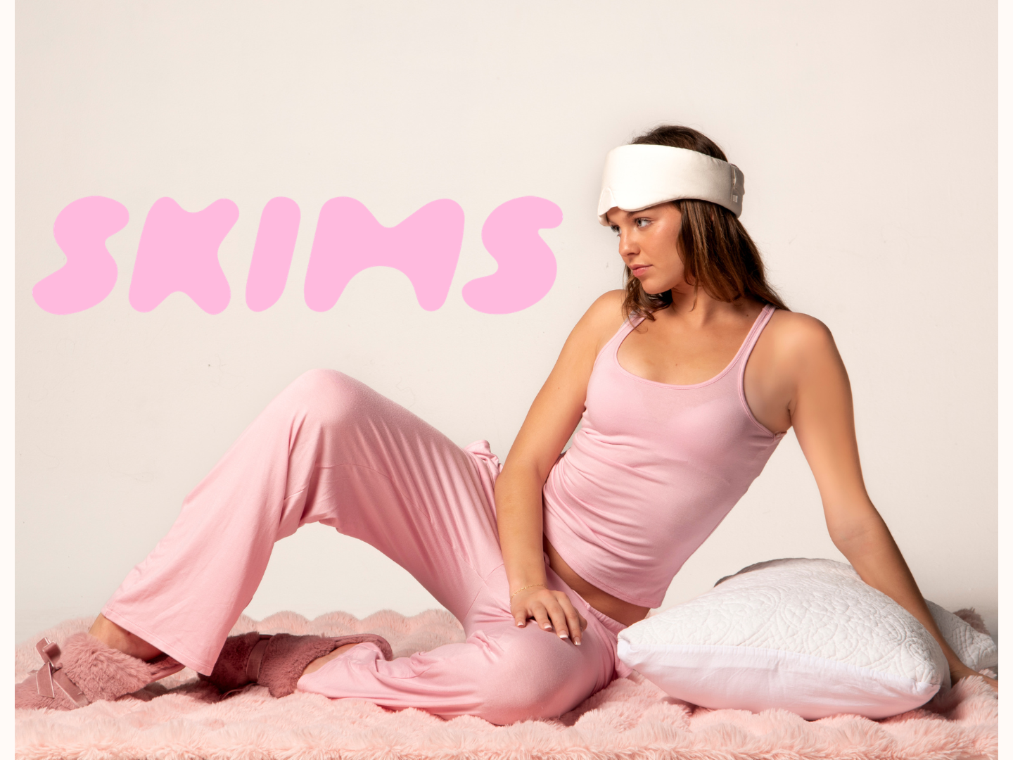
Love reframed as self-care: comfort, quiet intimacy, and choosing yourself.
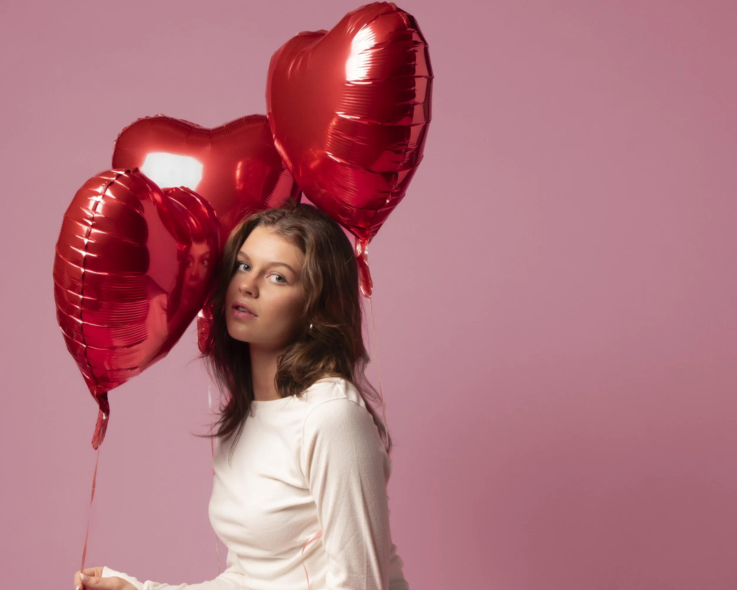
This campaign was a full creative exercise from concept to completion, one of the most hands-on projects I've taken on.I wore every hat: creative director, photographer, stylist, producer, and brand strategist. This gave me a rare end-to-end perspective on what it takes to bring a campaign to life.
The Inspiration
Drawing from Skims' signature holiday campaigns, the goal was to honor their clean, minimal aesthetic while nodding to the playful, slightly quirky energy that makes their content so recognizable. Rather than mimicking their style, I wanted to understand why it works and build something that felt authentically aligned with the brand.
The Outcome
This campaign reframed Valentine's Day as an act of self-care rather than romantic performance. The focus shifted inward, to comfort, quiet intimacy, and the simple act of choosing yourself. Soft, cozy images ground the visual language, with gentle poses, minimal styling, and understated Valentine's references that feel intentional rather than on-the-nose. Femininity and ease are held in balance throughout, reflecting the way Skims positions itself not just as a clothing brand, but as a feeling.
Coastal Peaks Coffee
-
Coastal Peaks Coffee -
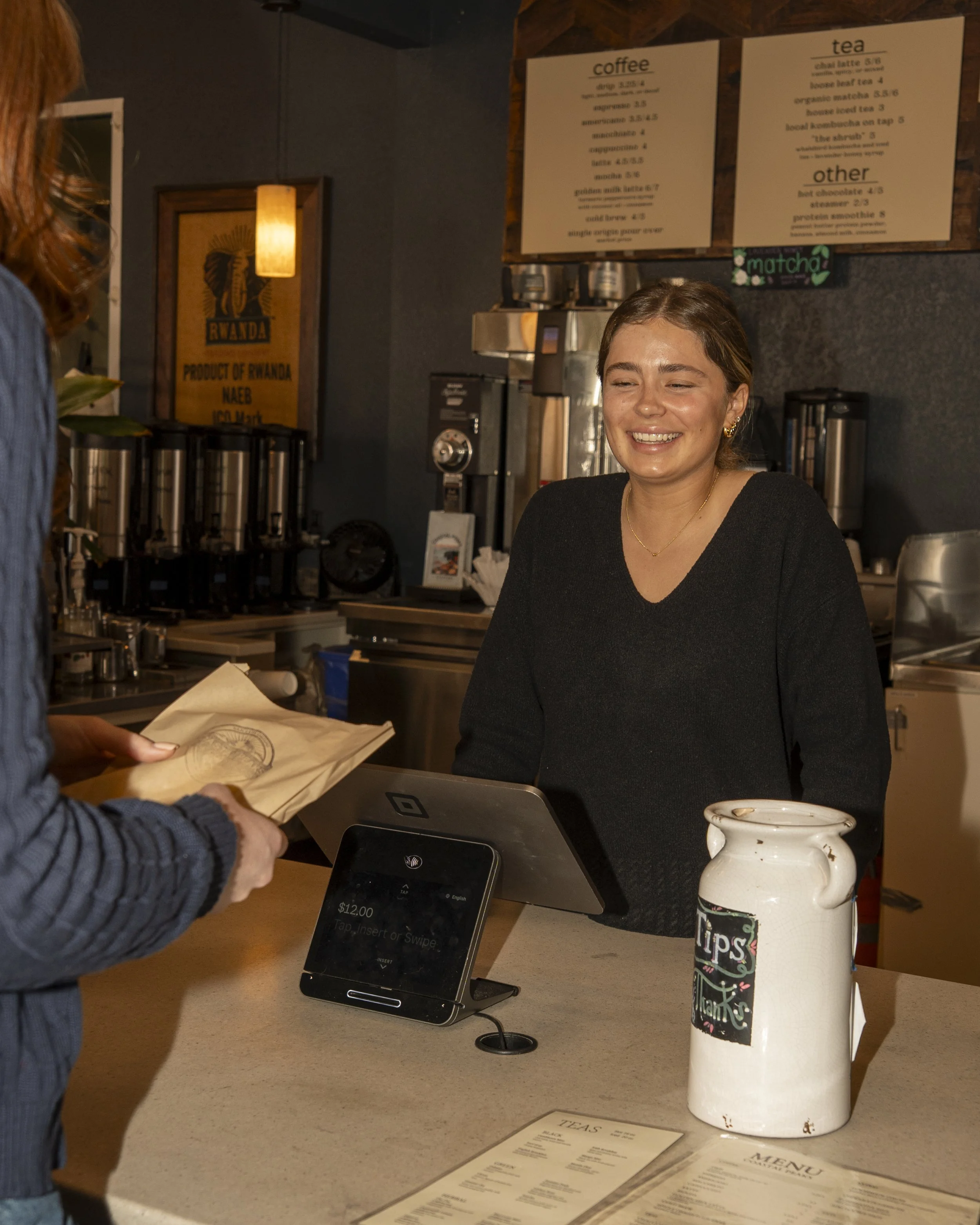
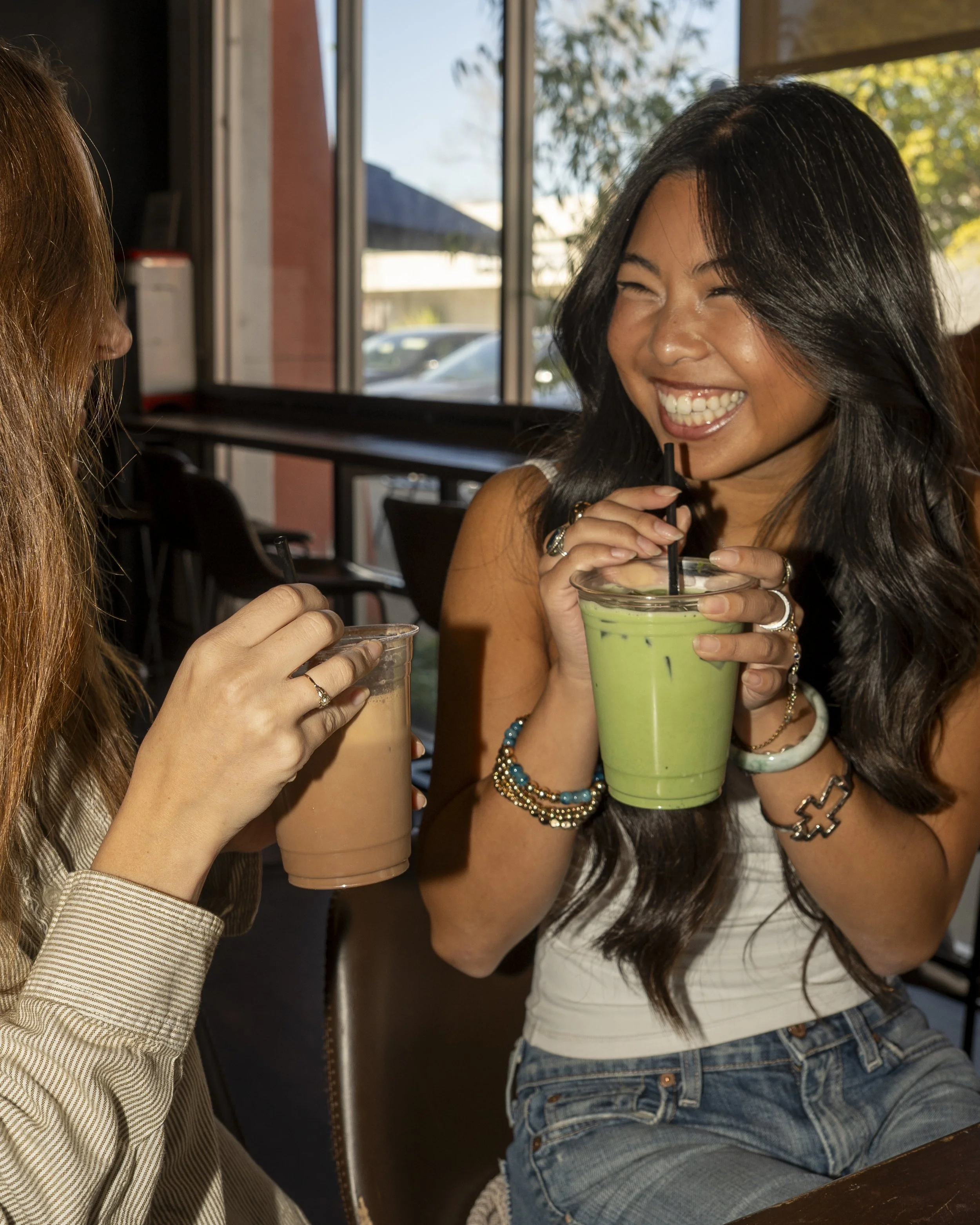
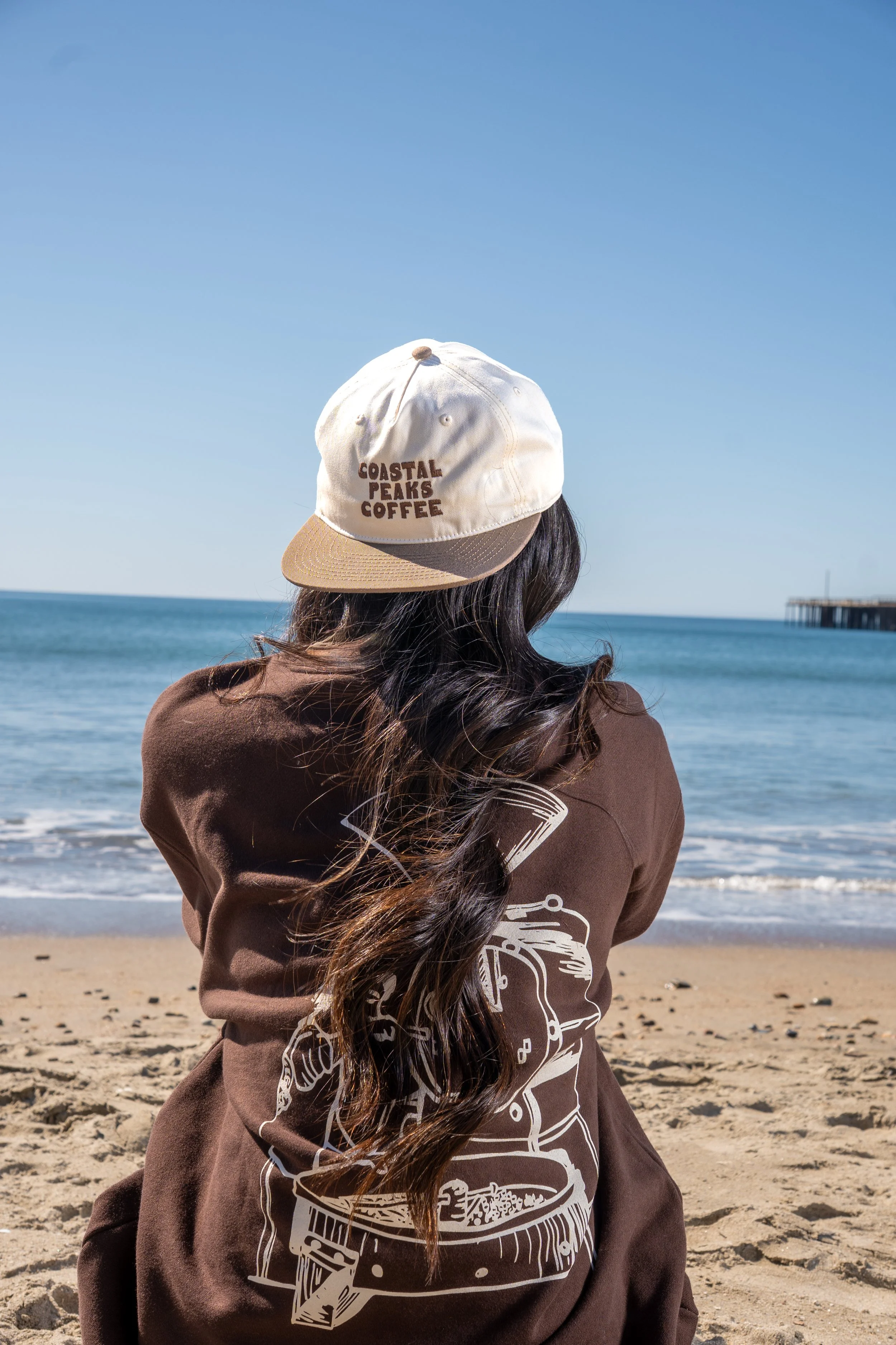
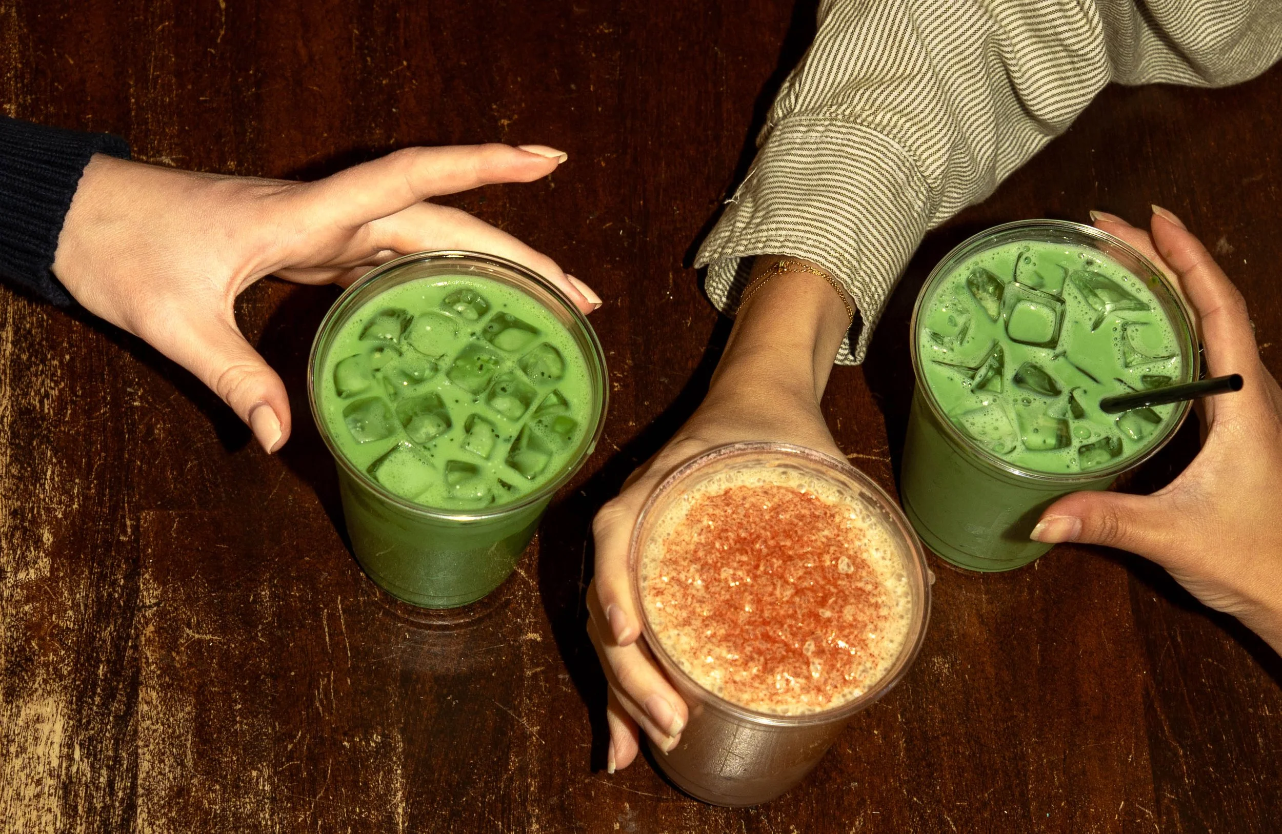
CPC Collaboration | Advertising Photography
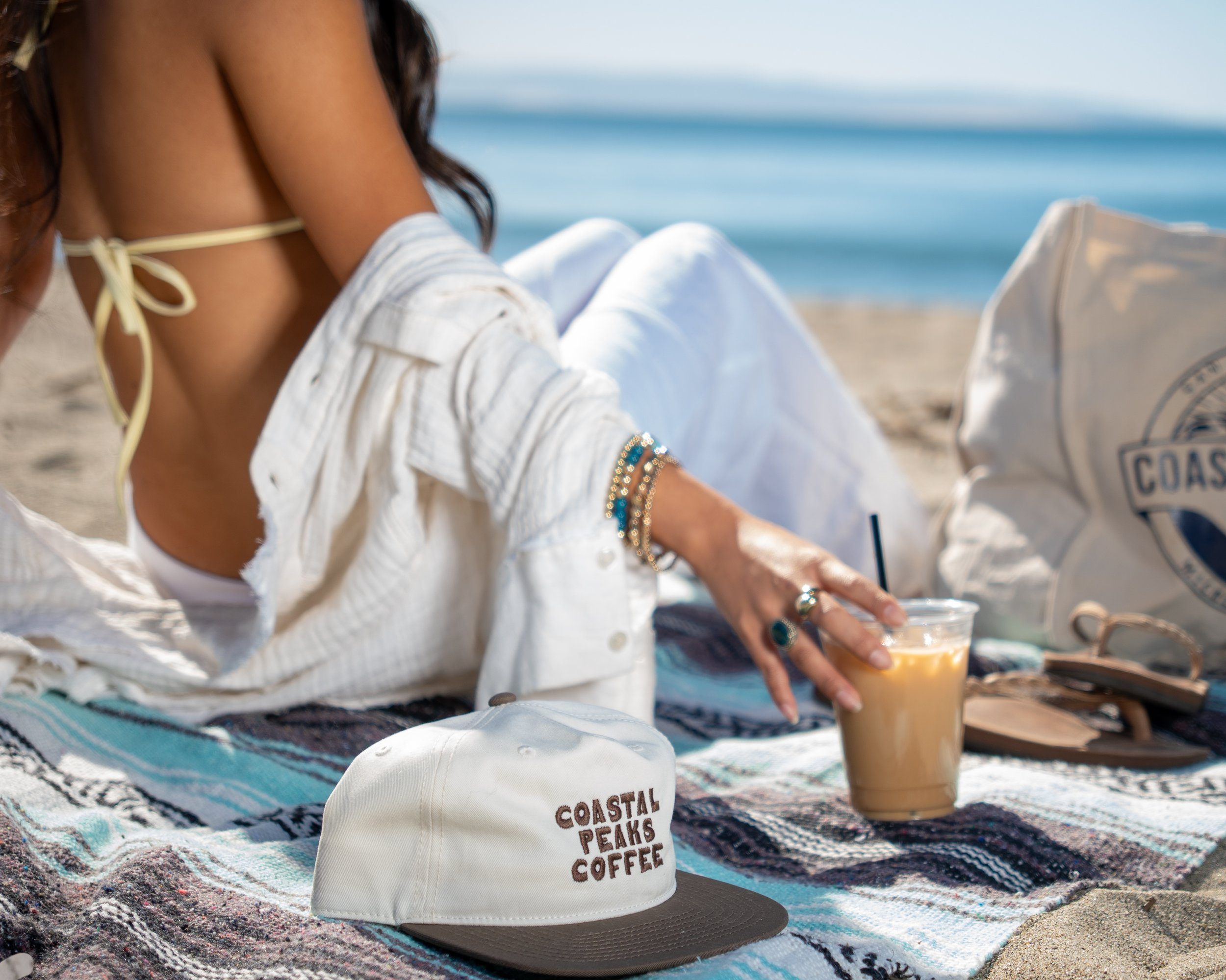
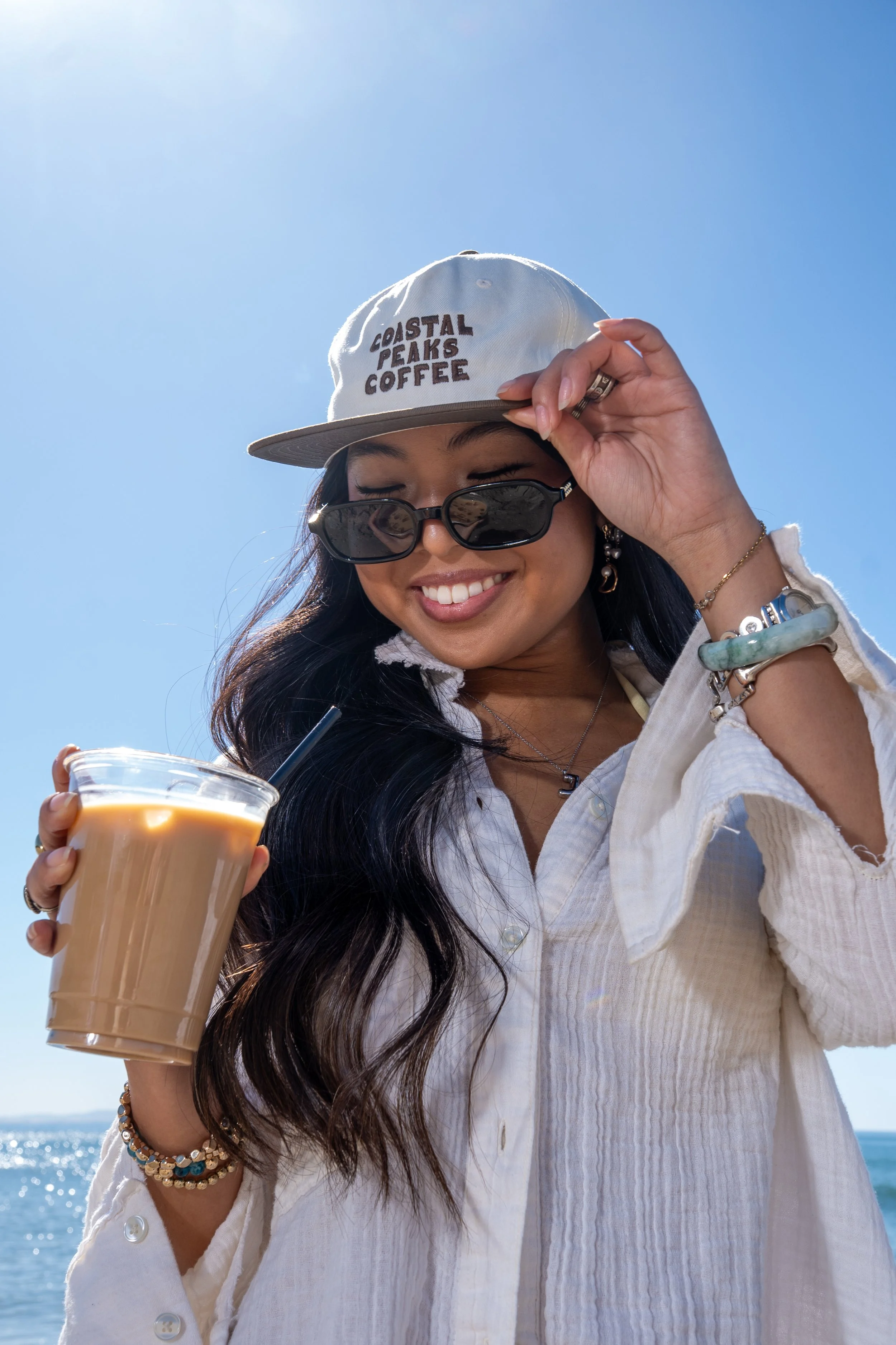
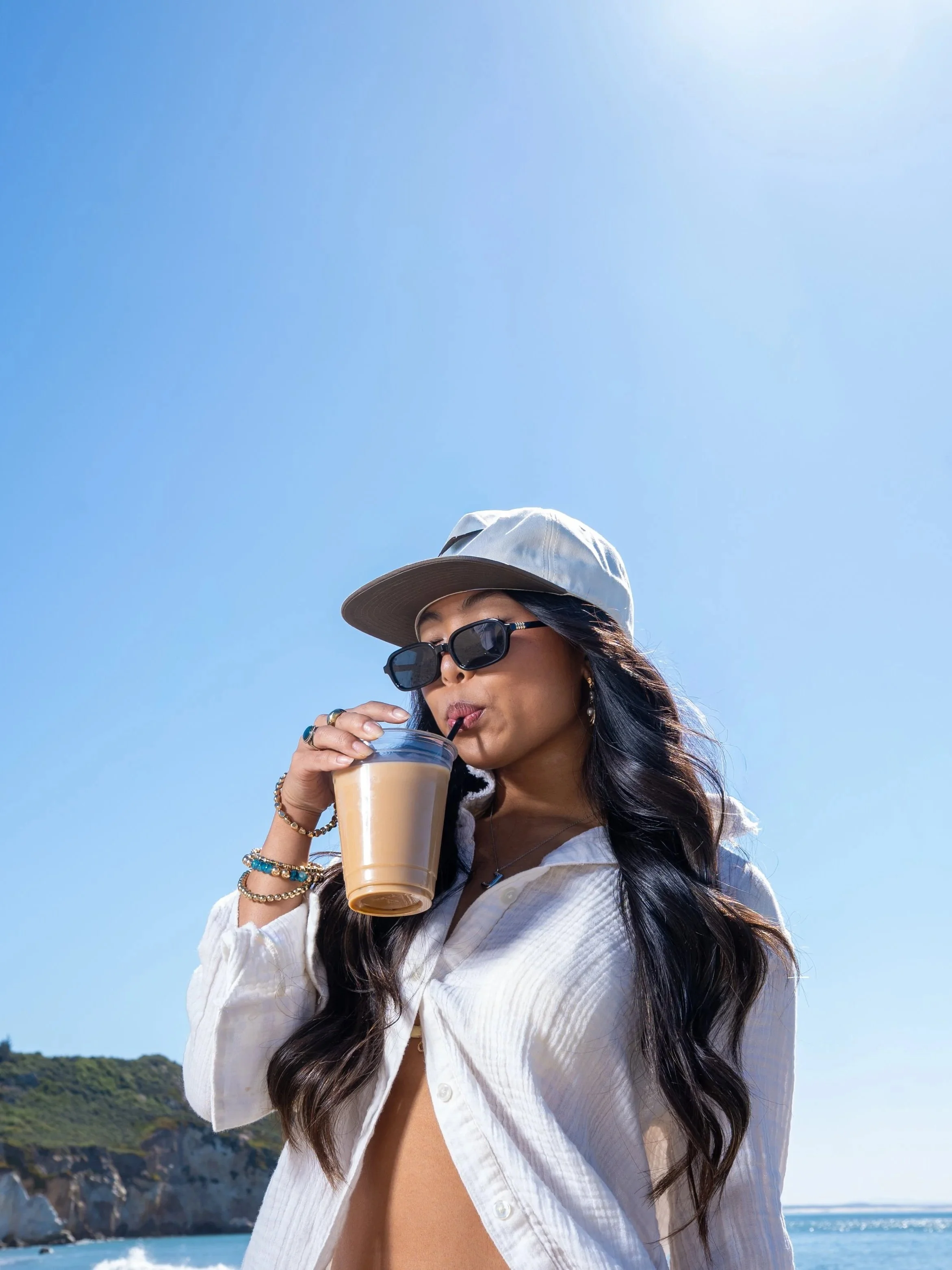
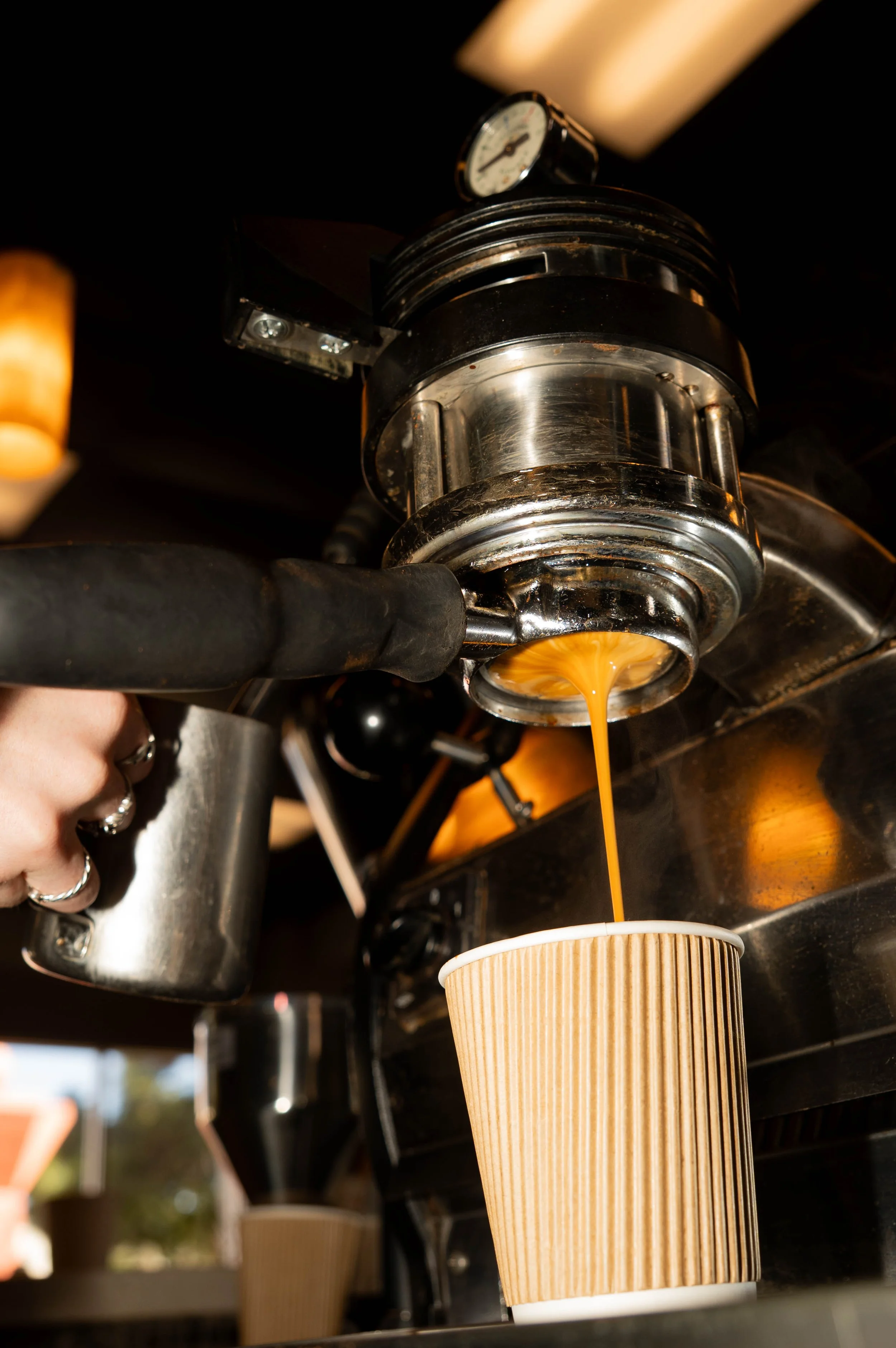
This project was a collaborative advertising photography campaign developed for Coastal Peaks Coffee, a community-driven micro-roaster based in San Luis Obispo. Working as a team of Cal Poly students, our goal was to translate CPC's warmth, quality, and community-first mission into a cohesive visual story.
The Concept
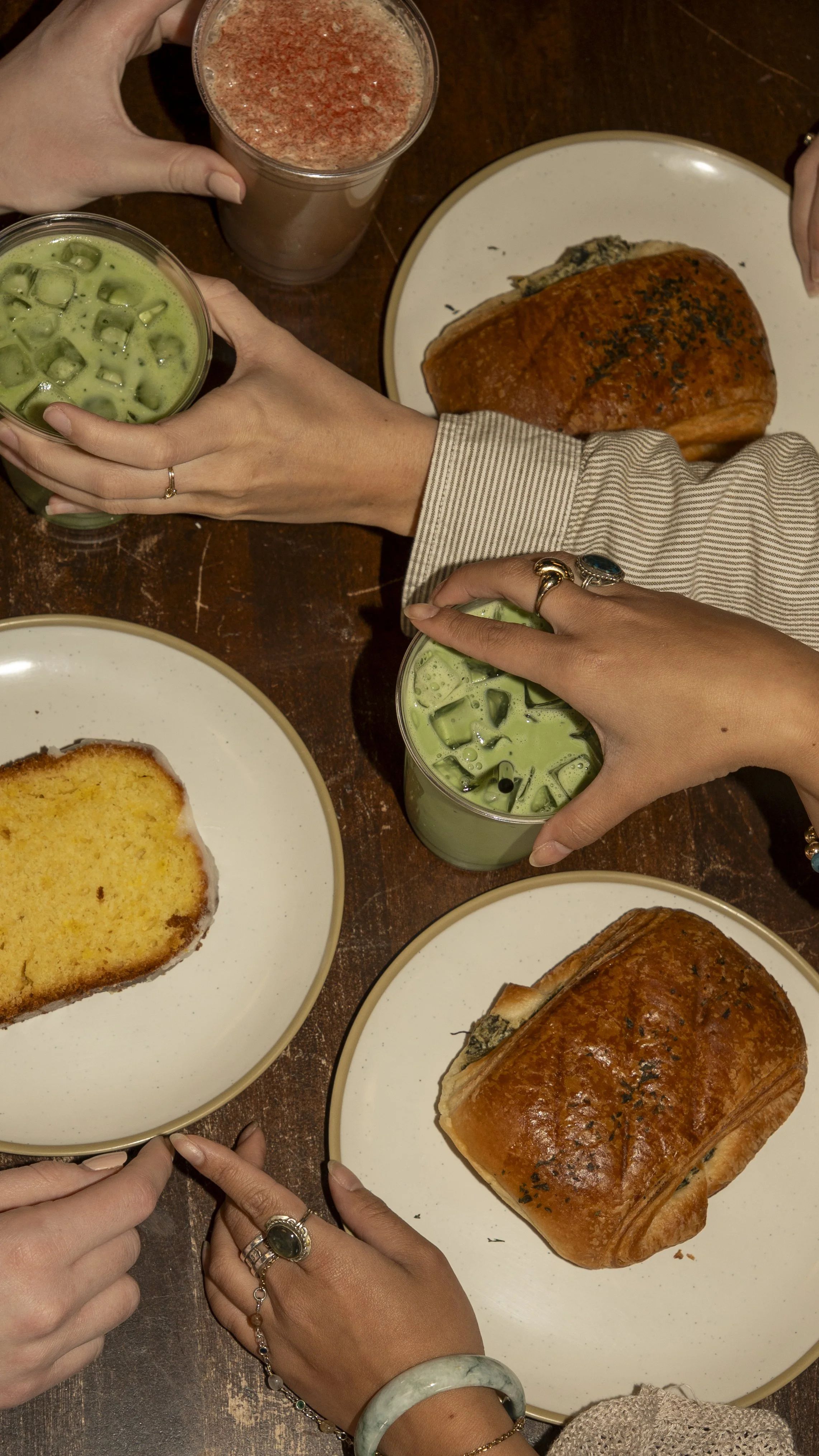
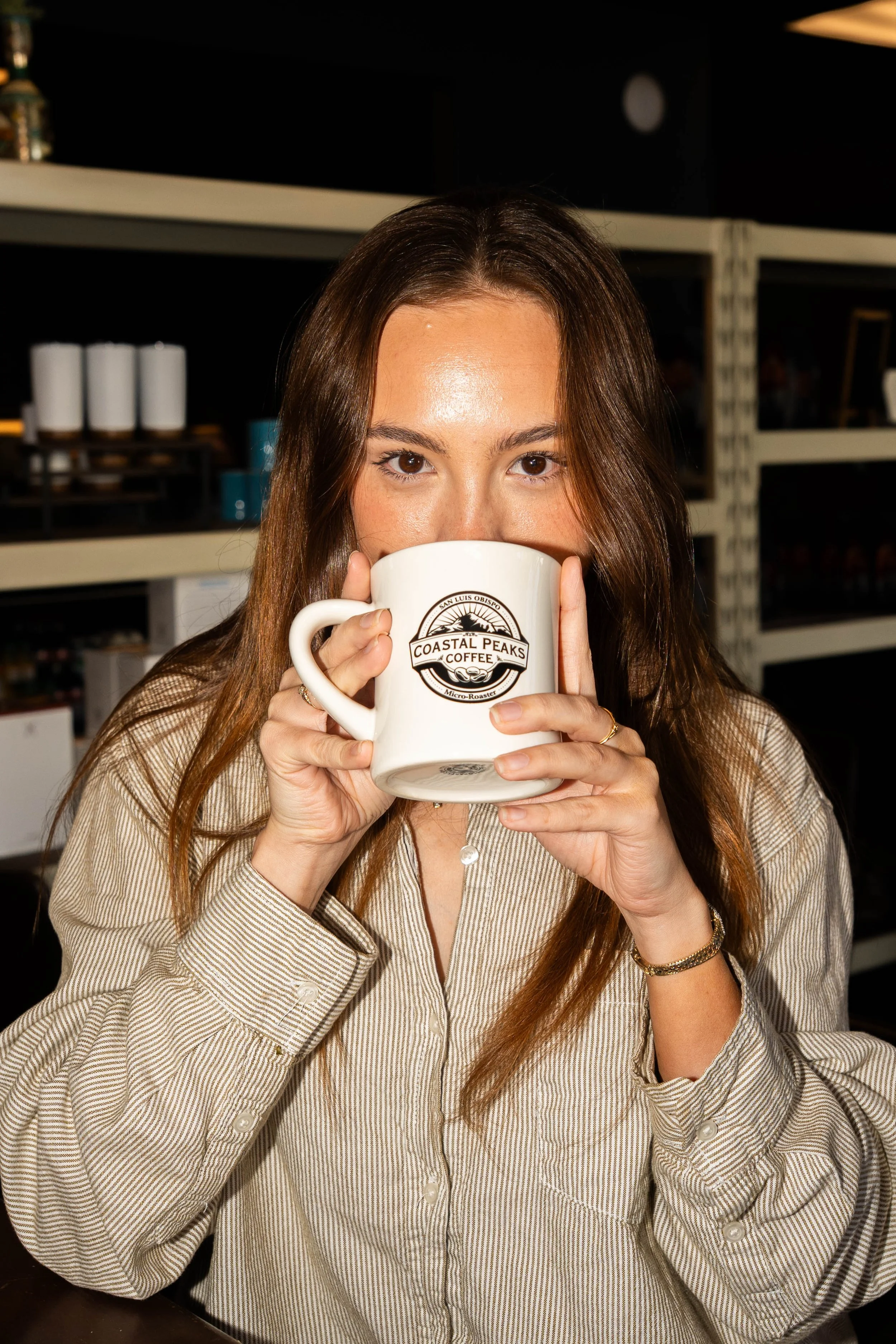
Coastal Peaks isn't just a café, it's a gathering place. Our campaign set out to capture that feeling: the connection, the everyday joy, and the quiet comfort that comes with a good cup of coffee. Rather than producing a purely product-focused shoot, we built a lifestyle-driven narrative around the people and moments that make CPC what it is.
The Approach
The campaign was shot across two distinct locations (Coastal Peaks Cafe and Avila Beach), giving the project two visual worlds to work with. The cafe set focused on the warmth of the interior: baristas at work, hands wrapped around mugs, the energy of people gathered together. The on-location beach set brought a more open, sun-soaked lifestyle feel, placing the product within the relaxed coastal identity that defines SLO.
Pre-production was thorough and intentional. We developed detailed shot lists for both locations, sourced props, planned wardrobe and hair, scouted casting, and built out a full production schedule and timeline to keep the shoot running smoothly.
The Deliverables
The final package included 8 hero shots, 30 batch images, and 5 short-form videos, a complete media package ready for use across CPC's marketing and social platforms.
“Quality coffee that makes people happy and connects our community.”
Rhode Pocket Blush
-
Rhode Pocket Blush -


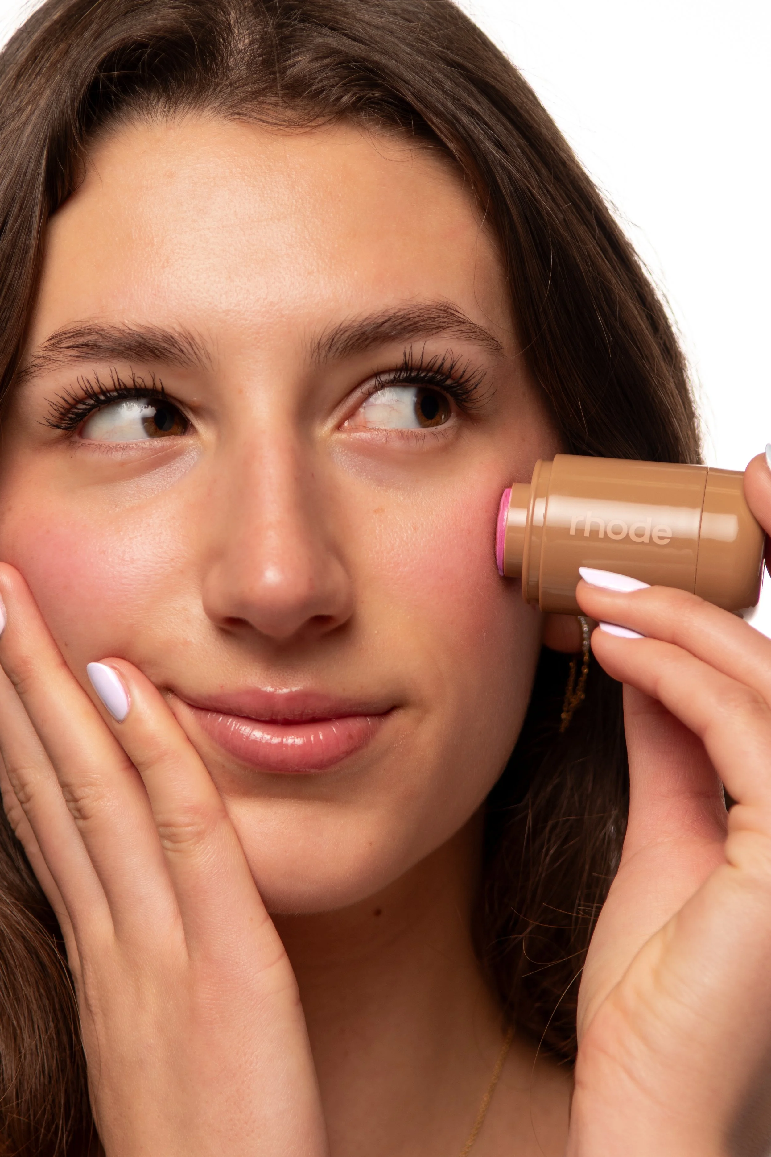
Rhode Recreation
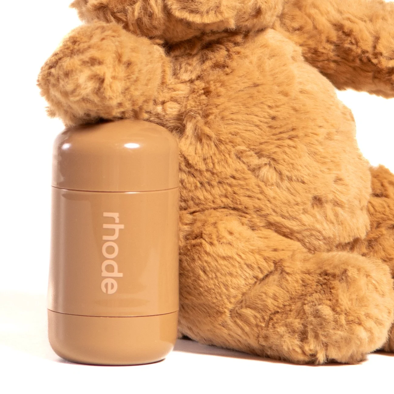
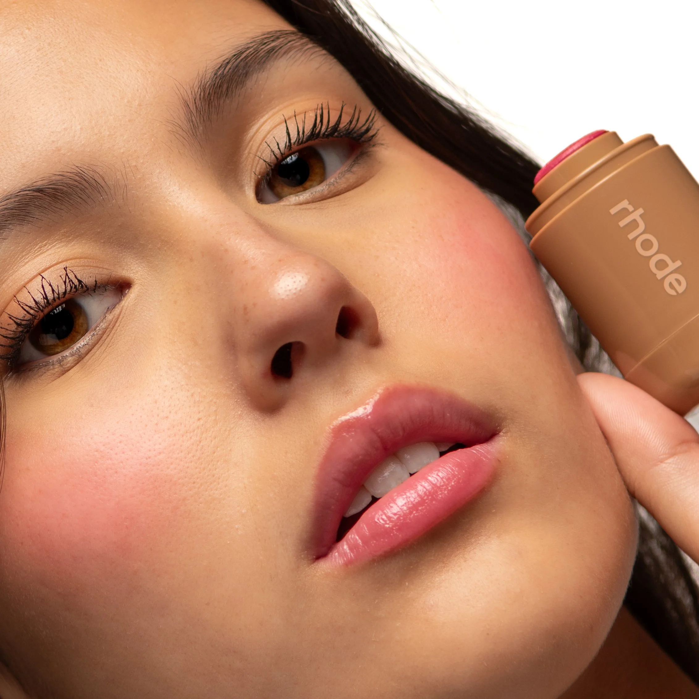
For this project, I studied and recreated an existing Rhode advertising campaign, producing original imagery that captured the brand's signature aesthetic from concept through final shoot.
Before picking up a camera, I immersed myself in the brand by analyzing Rhode's visual identity, studying the work of the original advertising photographer, researching the agency behind the campaign, and dissecting the goals and target audience the campaign was built around. That research phase was just as important as the shoot itself. Understanding why Rhode's imagery looks the way it does (the softness, the skin-first sensibility, the quiet intimacy) was what made it possible to recreate it with intention rather than just imitation.
The final deliverables included both model photography as well as product and still life shots, mirroring the dual visual language Rhode uses across its campaigns. Getting the model imagery to feel effortless while keeping the product shots clean and brand-aligned required a careful eye for light, styling, and composition throughout.
This project sharpened my skills in art direction, advertising photography, and brand analysis — and pushed me to think like both a photographer and a strategist. It reinforced how much intention sits behind imagery that looks effortless, and how deeply understanding a brand translates directly into stronger, more intentional creative work.


International Center
-
International Center -
Learn By Doing: Abroad
I developed a campaign that reimagined Cal Poly’s “Learn by Doing” motto through the lens of study abroad. The objective was to position international programs not just as travel experiences, but as hands-on learning opportunities that extend the CP’s core values beyond campus.
I was in charge of concept development, messaging strategy, and creative direction. The campaign highlighted experiential learning through compelling visuals with videos submitted by students. By aligning the messaging with Cal Poly’s established brand identity, I ensured the campaign felt authentic to the International Center while offering a fun, global perspective.
This project strengthened my skills in brand alignment, strategic messaging, and campaign development, while showing my ability to stick to existing institutional values and still creating an engaging marketing concept.
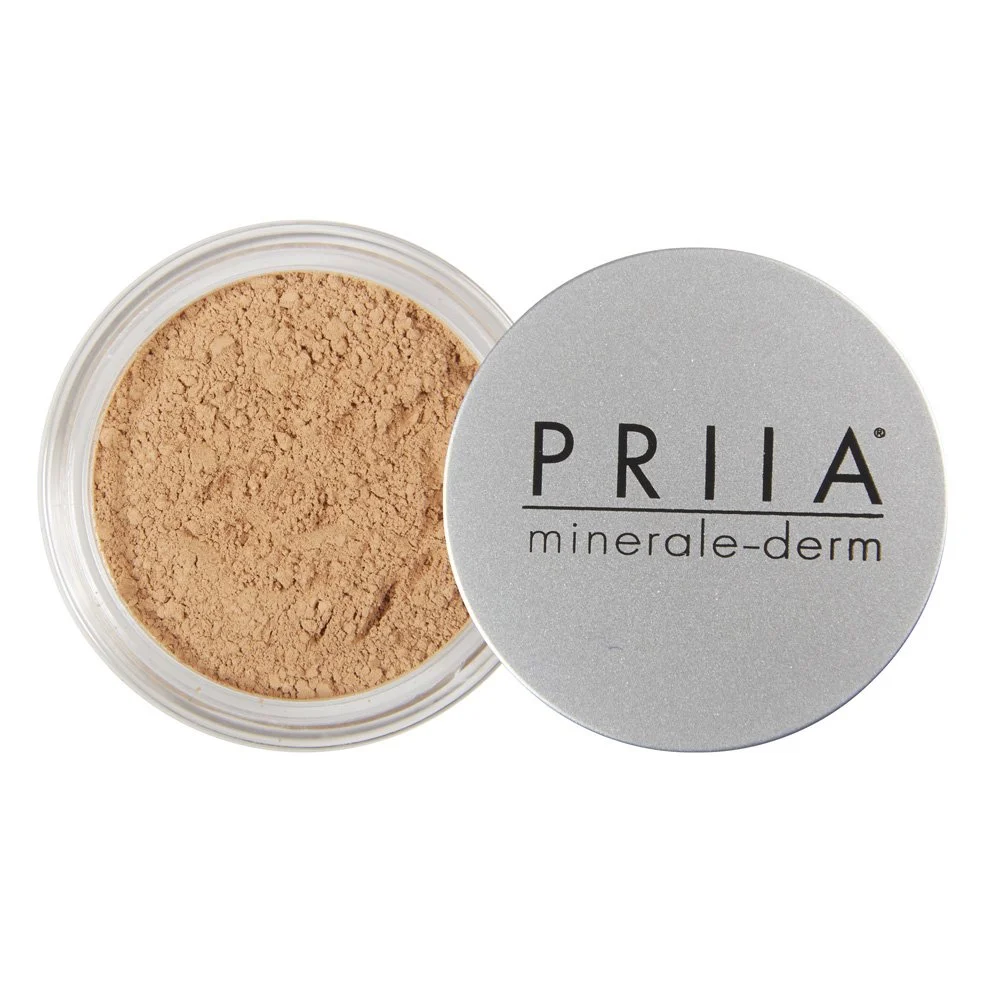
PRIIA Clean Makeup
-
PRIIA Clean Makeup -
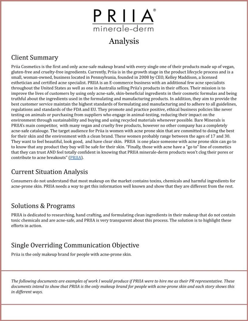
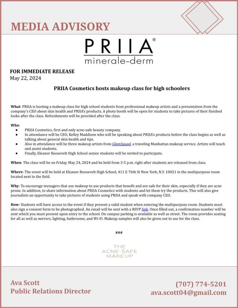
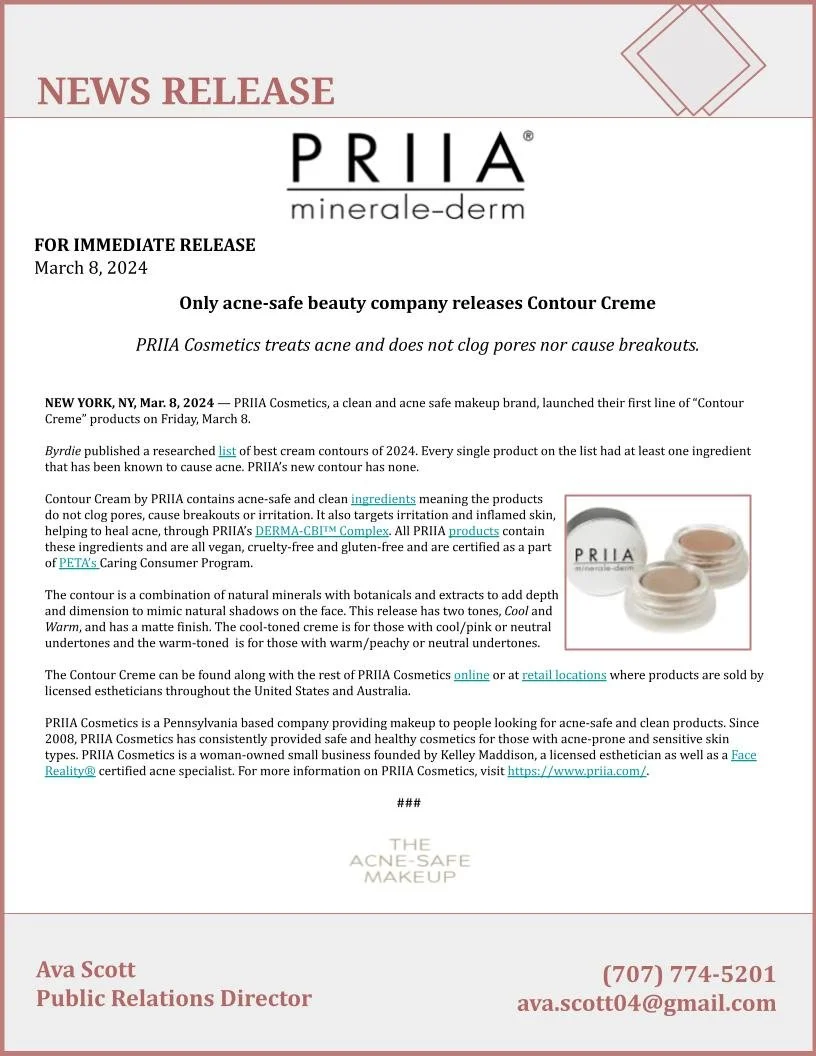
For a PR course project, I developed a comprehensive media kit for PRIIA Cosmetics, a clean, acne-safe makeup brand formulated specifically for sensitive and acne-prone skin. The objective was to position the brand as the go-to for people with acne-prone skin.
The media kit included a strategic news release, media advisory, brand analysis, fact sheet, and feature story. I conducted research on the brand’s mission, target audience, and industry landscape to
ensure messaging was credible and aligned with PRIIA’s core values.
Through this project, I advanced my skills in strategic writing, media relations, audience analysis, and brand storytelling across multiple PR formats to make a complete media kit. The final deliverables demonstrate my ability to craft clear, professional materials tailored to both journalists and consumers.
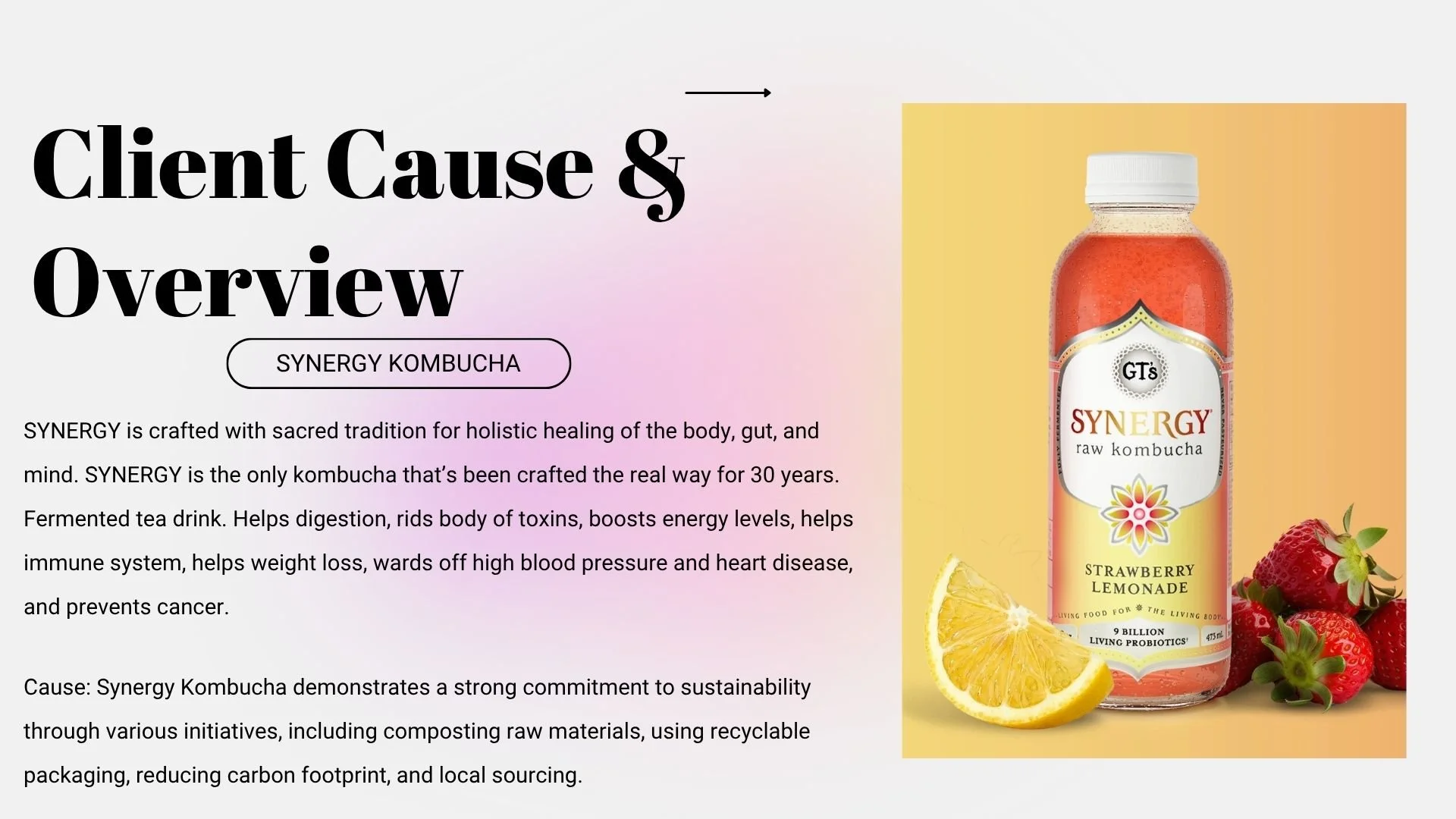
SYNERGY Kombucha
-
SYNERGY Kombucha -
For this collaborative agency-style project, I helped develop an Instagram campaign highlighting SYNERGY Kombucha’s environmental and sustainability initiatives. The objective was to reinforce the brand’s commitment to both personal wellness and planetary health while increasing brand impressions and engagement.
Our team researched SYNERGY’s sustainability efforts, including their recyclable glass packaging, composting practices, carbon footprint reduction, and local sourcing, to inform the campaign’s messaging and creative direction. We crafted the core message, “Sip good, Do good,” positioning the brand as equally committed to a healthier body and a healthier Earth.
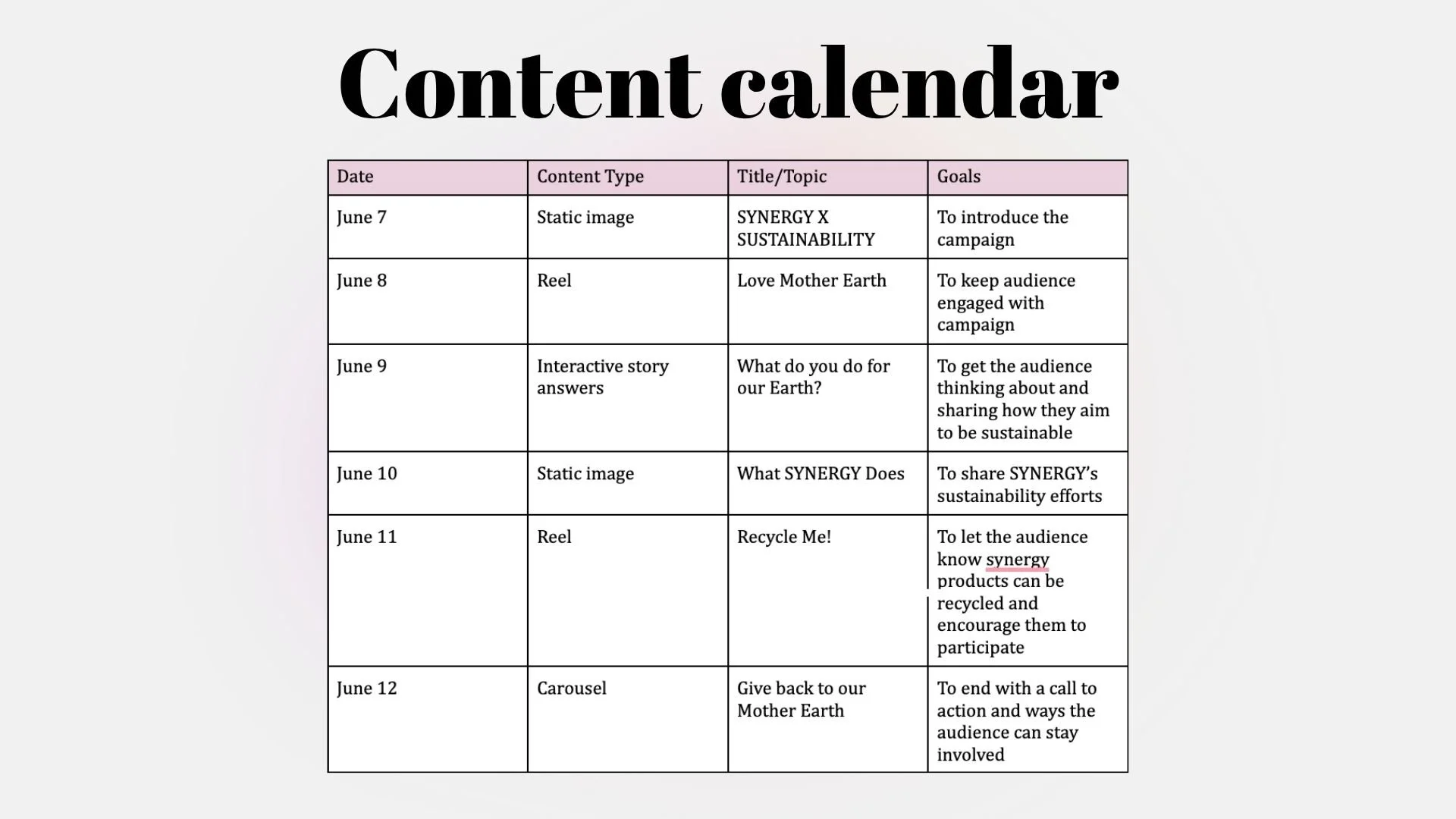
I contributed to content ideation, caption writing, and campaign strategy, helping develop a content calendar that included carousel posts, educational graphics, interactive stories, and short-form reels. Sample executions included a “Day in the Life of a Recycled Bottle” reel, a carousel explaining why SYNERGY uses glass packaging, and a “10 Ways to Give Back to Mother Earth” post that connected brand values with actionable consumer behavior.
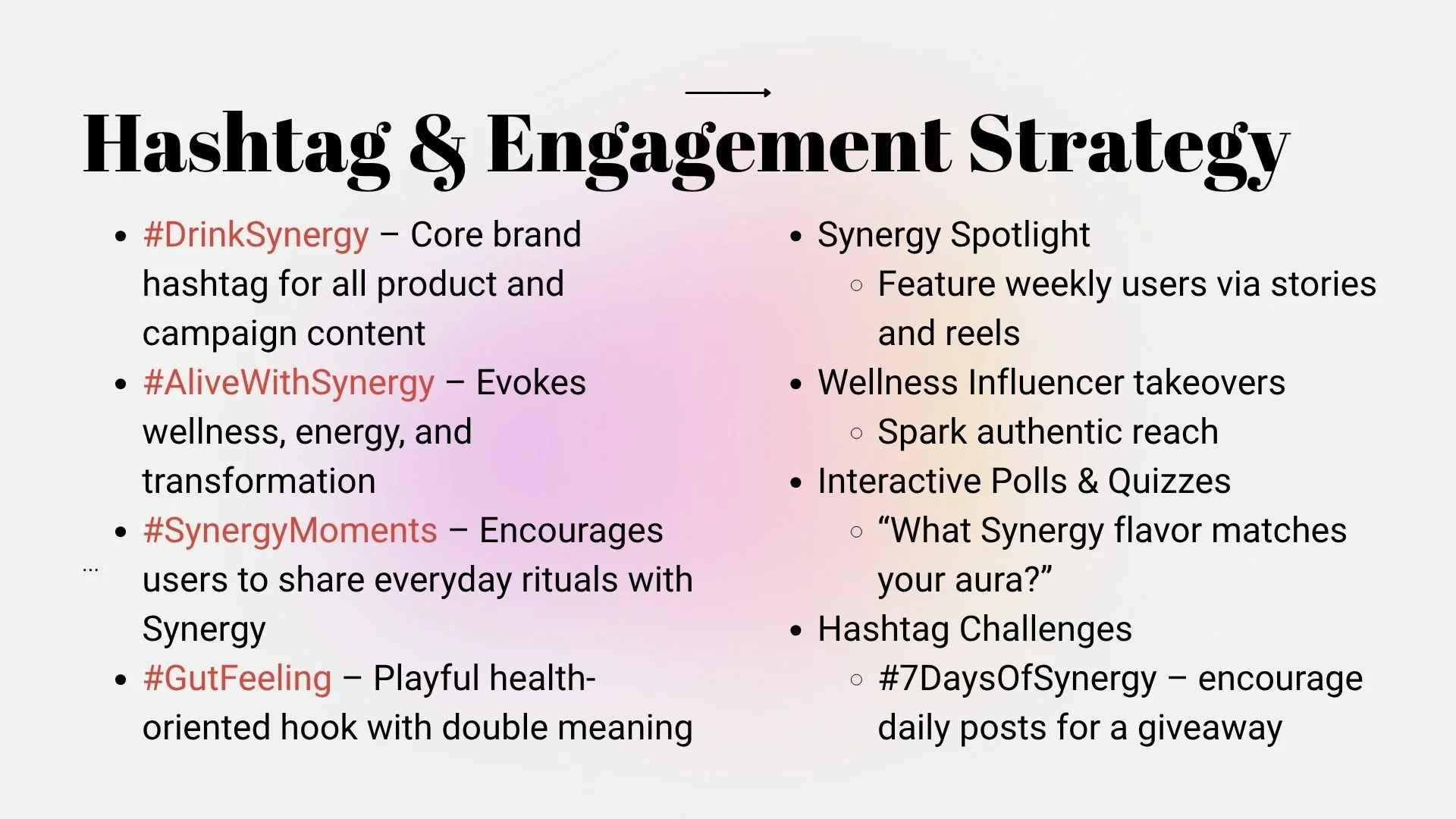
We also designed a hashtag and engagement strategy to drive community interaction, incorporating branded hashtags, influencer takeovers, user-generated content features, and interactive polls.
This project strengthened my skills in integrated campaign development, sustainability messaging, audience targeting, and strategic social media planning within the health and wellness space. It provided valuable experience in maintaining consistent brand messaging while delivering engaging and entertaining content.